Who can use the product?
The W3C’s introduction to web accessibility describes a web that people with disabilities can perceive, understand, navigate and interact with. It explains why accessible design matters for individuals and organisations. That purpose belongs at the start of a product discussion, alongside usefulness and visual quality. W3C’s introduction
A small interruption reveals a lot
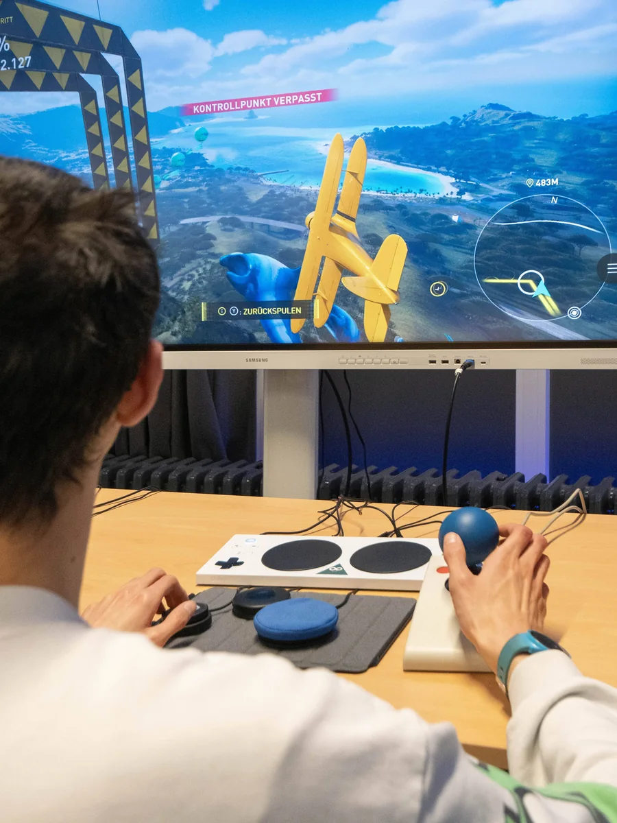
Imagine someone completing a form on a train with one hand, or navigating a site with a keyboard. A disappearing label, an unclear error or a control visible only on hover can turn a small task into an obstacle. These examples do not replace accessibility testing with disabled users; they help a team notice assumptions in its own design.
A beautiful interface still needs to be usable.
Craft includes the quiet details
Readable contrast, descriptive links, meaningful structure and visible focus are part of the interface. So are errors that explain how to recover. A rich visual identity can coexist with those qualities. The challenge is to make the visual idea work through different ways of reading and interacting.
Keep the ambition
Our view: accessibility should sharpen creative work. If an animation carries meaning, find a way to communicate it when motion is reduced. If a composition is striking, make its reading order clear. The aim is to deliver the idea to more people with less friction. That is a demanding design brief, and a worthwhile one.
Sources & further reading
W3C WAI · Introduction to Web AccessibilityPublished by Capvise Media. Editorial standards · Corrections